
CUGY MIDDLE SCHOOL
From architectural detail to typeface system
Client: Cugy Middle School
Year: 2021

The starting point: elongated oval railings with flat edges found throughout the school building.

Wooden lockers labeled with the typeface.
When Emilie Excoffier and Manon Schaefer of Enen Studio were commissioned to design the wayfinding system for a school in French-speaking Switzerland, they noticed something unusual: a distinctive railing appeared everywhere throughout the building. Its elongated oval shape with flat edges became omnipresent, repeated across corridors, staircases and outdoor spaces. For the Fribourg-based design duo, known for their systematic research approach and dialogue-driven practice, this architectural detail wasn’t just decoration. It was the foundation of a visual language.
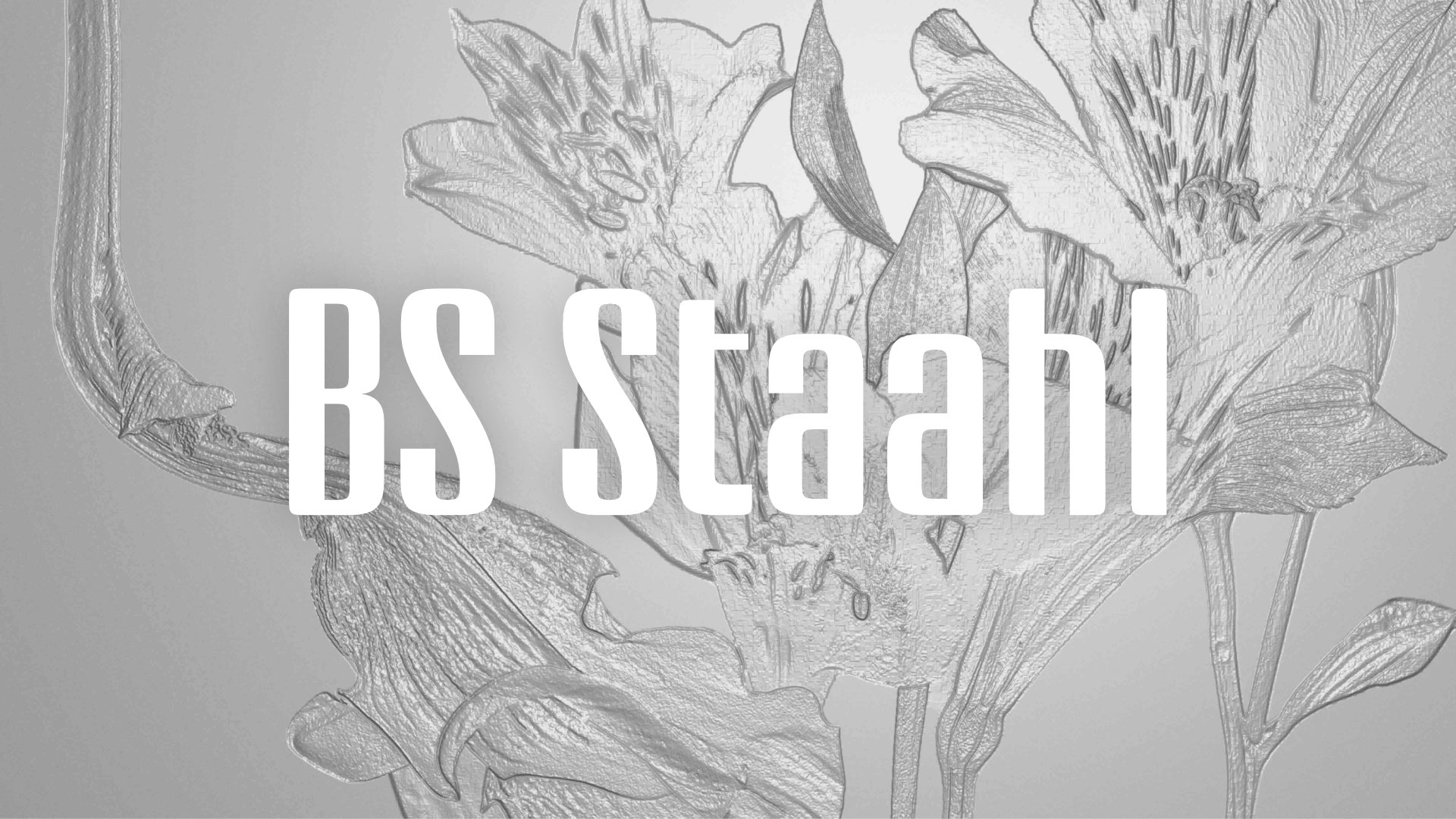
They brought the idea to Arthur Schwarz, Bolid System’s co-founder. What started as a consultation quickly evolved into a full collaboration, with Schwarz taking the design lead on what would become BS Staahl, a display typeface that translates architectural modularity into typographic form.
Family overview
CUGY MIDDLE
CUGY HIGH
Finding the system in the detail
The challenge was clear from the start: create a wayfinding typeface that works at both large and small scales, readable from across a hallway and up close on locker numbers. And it had to be printable on concrete, a rough, imperfect surface where fine details could disappear into the material’s natural texture.
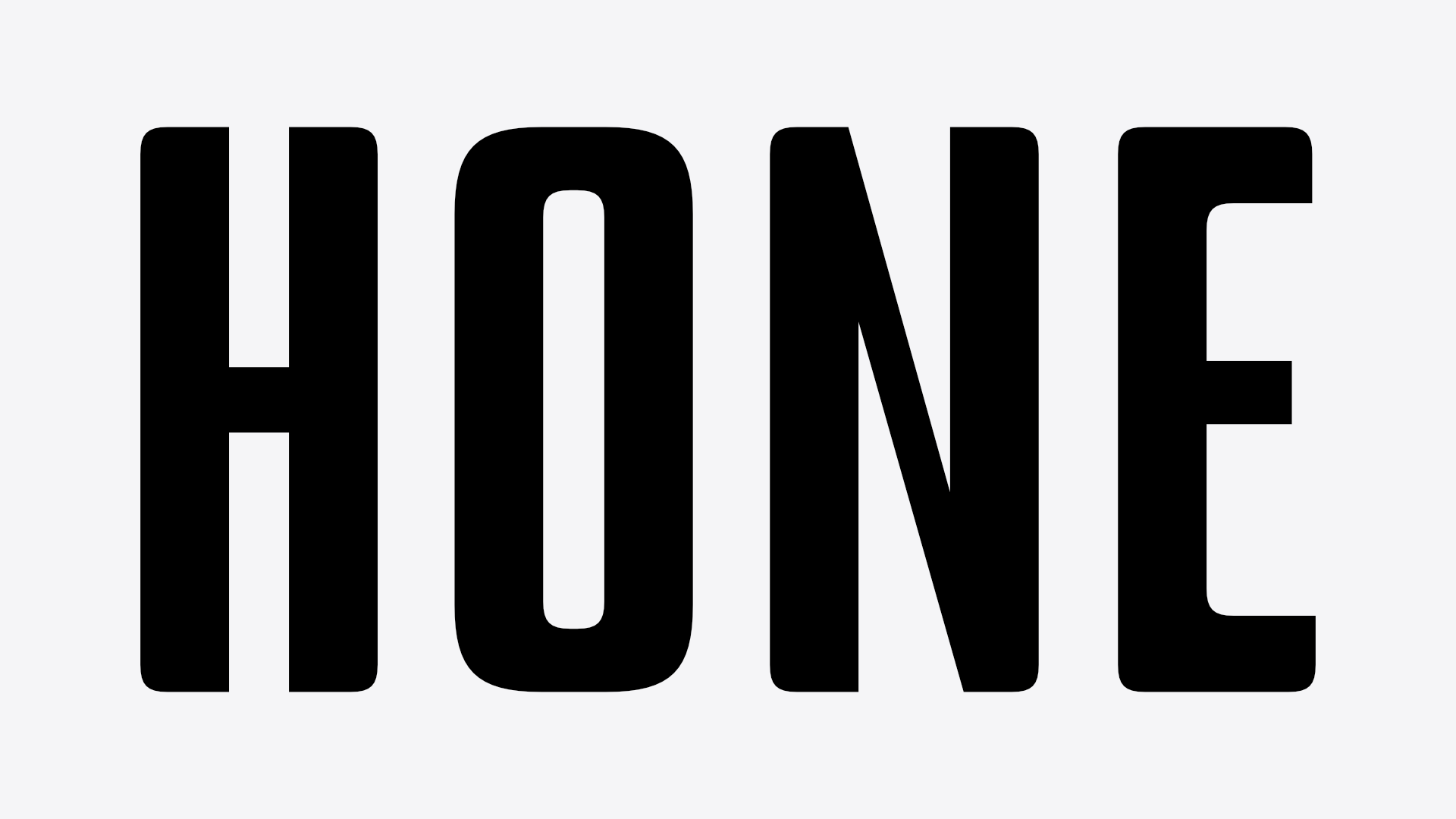
Schwarz’s solution began with the railing itself. For certain letters like H, O and D, the process was straightforward: capturing the curve created by the railings and translating the radius directly into the design software. But the real design work emerged with letters containing diagonals: K, X and Y. These characters presented a fundamental problem: the railing system contained no diagonal elements, only verticals and horizontals.
The solution came through establishing a formal rule that would govern the entire typeface. Interior angles remain sharp and pointed, while exterior angles adopt the railing’s rounded form. This creates a subtle but consistent visual rhythm that maintains the architectural reference without becoming a rigid transcription of the source material.

Large-scale implementation on concrete walls.
Variable contrast for variable context
To address the scale challenge, Schwarz implemented a contrast axis into the font. The display version exaggerates details and contrast for visual impact at large sizes, while the text version reduces contrast for improved legibility at smaller scales. This approach builds on the classical typographic tradition of having distinct text and display versions, but pushes the contrast further to create something more striking.
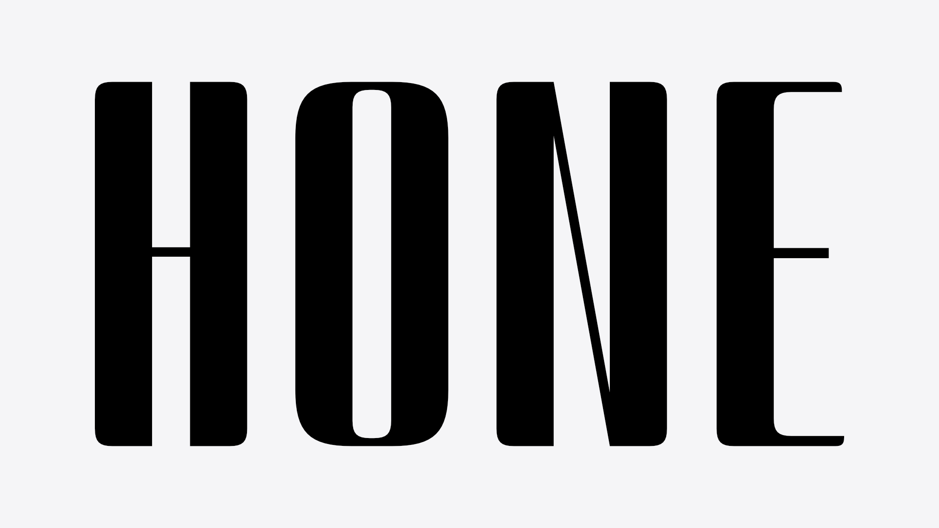
Interactive specimen showing the variable contrast axis between Middle and High versions.
The decision to keep the font as capitals-only served both aesthetic and pedagogical purposes. The goal was to fill the entire height and create the feeling of a unicase font while maintaining practicality. Since the school serves children still developing literacy skills, a true unicase system would have been counterproductive. Capitals-only meant all characters share the same height, supporting readability and reducing visual confusion for young readers.


The typeface in its architectural context.
Engineering for reality
The concrete printing requirement added another layer of technical consideration. Even on well-finished smooth concrete, there are always small imperfections: holes, irregularities and texture variations. If a stroke was too thin and landed on such an impurity, it risked disappearing entirely. This constraint informed the development of different optical sizes within the variable system.

Directional signage in the school corridors. (1/2)

Directional signage in the school corridors. (2/2)
From commission to catalog
What began as Cugy, the working name tied to the specific school commission, has evolved into BS Staahl, now available in Bolid System’s catalog with a complete character set including lowercase letters. The typeface has grown beyond its architectural origins while maintaining the formal logic that makes it distinctive: that interplay of sharp interior angles and rounded exterior curves, the modular sensibility and the careful balance of impact and legibility.

Architects: Berchier Architectes
Article: Arthur Schwarz (Bolid System)
Graphic design + Signage: Enen Studio
Photography: Guillaume Baeriswyl
Type design: Enen Studio × Arthur Schwarz (Bolid System)
You may also like

Information
Support
Follow us
Fonts
Free Trials
Copyright © 2026 Arthur Schwarz & Maël Bächtold. All rights reserved.